I moved to Massachusetts in the summer of 2015, and from what I’ve been told, I still haven’t experienced a “real” winter. The last one that earned that title was apparently the brutal 2014–2015 season. That got me wondering how weather in Massachusetts has actually changed over time, especially in winter.
This project started as a simple weather analysis, but quickly turned into something much bigger: a data cleaning and exploration process involving hundreds of weather stations, millions of records, and a few wrong turns along the way.
Instead of just showing the final charts, I wanted to show the path it took to get there, because with real data, the path is often the most interesting part.
Starting with NOAA
As with most data projects, the first challenge was simply finding usable data. NOAA made it easy to search for historical weather records by region, and I initially tried to pull everything for Massachusetts from 1901 to the present.
That did not go well.
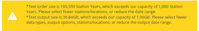
That query would have returned 105,559 station-years and 30.84 GB of compressed data. After extracting only a partial year-by-year download, I was already staring at nearly 70 GB of files. That was more than I wanted to process locally, so I changed tactics and went straight to the NOAA directory structure instead.
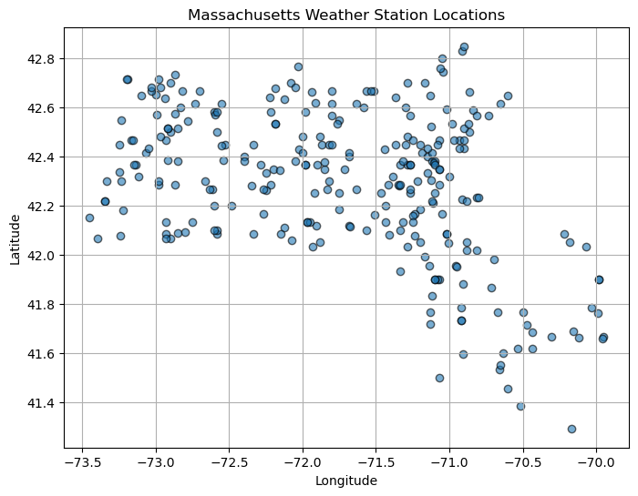
After some digging, I found a list of Massachusetts stations and wrote a small script to download only the relevant station files. That brought the project back into manageable territory: 274 files totaling 449.2 MB.
wget -r -nd -np -A 'US1MA*.csv.gz' ftp://ftp.ncei.noaa.gov/pub/data/ghcn/daily/by_station/Making the station data usable
The next problem was that the station metadata file wasn’t as clean as I expected. My first pass assumed it was tab-separated. It wasn’t. Then I tried splitting on whitespace. That also failed because some town names contain multiple words.
The fix was to read it as a fixed-width file instead. Once I did that, the station data fell into place and I could assign proper column names like station ID, latitude, longitude, elevation, state, and town.
From there, I downloaded all the raw station files and started exploring their structure. NOAA’s station-level files store each weather element-day as a separate row, so before I could analyze anything meaningfully, I had to merge the records with station metadata, convert units, and pivot the data into a flatter structure where each row represented a station-date combination.
pivoted = merged_df.pivot_table(
    index=['station_id','date','town','state','lat','lon','elevation'],
    columns='element',
    values='value_converted'
).reset_index()
The result was a much more analysis-friendly dataset with roughly 3.2 million rows. At that point, the data was finally in a shape I could work with.
This stage was a good reminder that “loading the data” and “understanding the data” are not the same thing. Much of the effort went into figuring out what the raw files actually meant, converting scaled values into real units, and attaching context like location and elevation so the dataset became interpretable instead of just technically valid.
In the end, I had an analysis-ready dataset with millions of weather records, hundreds of stations, and enough metadata to start asking better questions about temperature, snowfall, and winter trends in Massachusetts.
Temperature trends
Once the cleaning was finished, I moved into the part I had been looking forward to all along: asking what the data might actually say.
I started with a simple assumption: August is probably the hottest month on average, and February is probably the coldest. Using those as rough stand-ins for peak summer and deep winter, I plotted statewide average maximum temperatures over time and added linear trend lines.
The raw year-to-year values are noisy, but the trend lines make the bigger pattern clear: both months are warming, and February is warming faster than August. My regression estimates came out to about 0.38°F per decade for February and 0.29°F per decade for August. In other words, winters appear to be losing their chill faster than summers are heating up.
Snowfall and snow depth
Rising temperatures naturally raise the next question: what does that mean for snow?
I looked at two different measures: average winter snow depth and total winter snowfall. Snow depth trends downward over time, by about 0.06 inches per decade in my linear fit, suggesting shallower and less persistent snow cover.
But total snowfall told a more complicated story: it actually trended upward in this dataset, even as snow depth declined.
That apparent contradiction makes more sense when you think about the mechanics. Warmer air can hold more moisture, which can produce heavier snowfall during storms. At the same time, warmer winters also mean more thaw cycles, faster melting, and more rain at the edges of winter. The result can be more snow falling overall, but less of it sticking around.
Station coverage matters
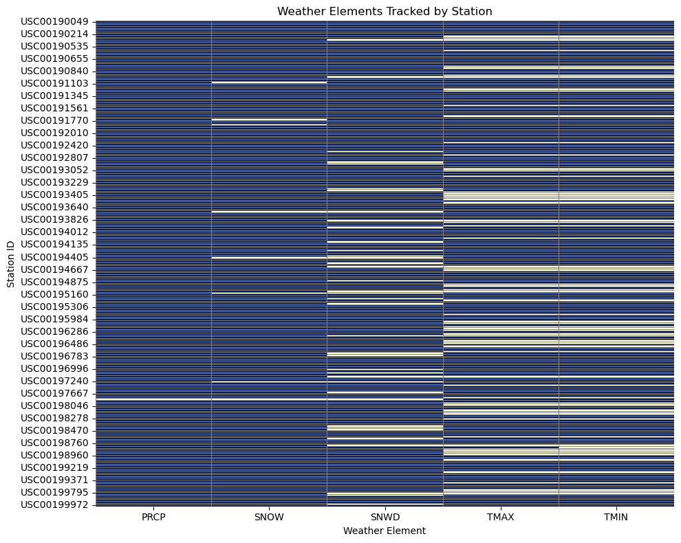
One thing this project made very clear is that not every station reports every weather variable. When I first built a statewide map of average maximum temperature, the result looked sparse and a little odd. After digging deeper, I found that many stations simply do not report TMAX or TMIN, which explains the missing coverage and reinforces how important it is to inspect source completeness before trusting a visualization.
Main findings
- Winter temperatures are rising, especially in February.
- Average snow depth is decreasing over time.
- Total snowfall appears to be increasing, even as snow cover becomes less persistent.
- Station coverage varies widely, so data cleaning and source vetting matter as much as the charts.
These aren’t just abstract numbers. They line up with a lived experience many people in New England already recognize: winters are getting milder, snow is less likely to stick around, and the freeze-thaw cycle feels more pronounced than it used to.
Where I’d take this next
This was only the first phase of the project. The next steps I’d want to explore include precipitation extremes, cross-state comparisons, interactive dashboards, and possibly linking weather trends to more human-centered data like school closings, snow removal budgets, or energy use.
Working with this much data wasn’t quick, but it was worth it. The process mirrored the climate story itself: messy, nonlinear, and full of surprises. One of the simplest lessons from the whole exercise is still the best one: look at the data. It doesn’t yell. It doesn’t spin. But it is always talking, if you’re willing to listen.